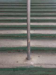
This photo has really changed be because it taught me a lot about lighting compositions and lines all in one picture. I am proud of this picture and I think it shows good composition and intriguing lighting.
This picture is my example for shape because you can see the roundness in the bulb.
This is my example of form because you can see the shadow and the different lighting in the picture which allows you to clearly make out that it is a three dimensional figure.
The difference between shape and form is that in shape you can only see the basic shape of whatever you are taking because there is not enough light or shadow. While with form there will be a shadow and light shining on it so you can make out the form and tell that it is 3 dimensional.
This is a picture that I took representing Repetition. Repetition is when the same thing is shown over and over in a row. Pattern is similar to this but instead of having one thing over and over it is multiple thing over and over in a row.
http://jacobwalter.weebly.com/about.html
This is my weebly about me page.
http://www.manginphotography.com/#!/about
This photographer influenced me and inspired me.
1. http://jacobwalterblog.blogspot.com/2015/06/final-project.html
2. http://jacobwalterblog.blogspot.com/2015/05/student-website-review.html
3. http://jacobwalterblog.blogspot.com/2015/05/first-commercial-shoot.html
I believe that the commercial shoot was my best project because it looked very professional and could pass off as a real North Face commercial. This project changed me because it made me realize that it wasn't very hard to make a advertisement picture and we still managed to make it look good with the use of our photography skills and photoshop. I learned to see differently because making adds for companies seems like a fun thing to do.


