Original Picture #1
Final Picture #1
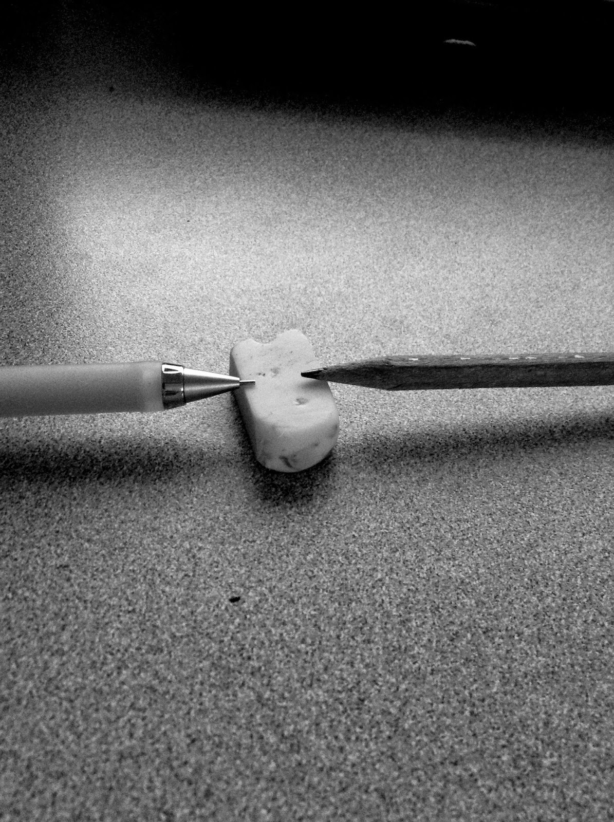
In this picture I took some of the colors out and darkened some of the blacks so that the shadows would stand out more.
Original Picture #2
Final Picture #2
In this picture I darkened the picture so that it was more dull and the entire picture would show more of a shadow.
Original Picture #3
Final Picture #3
I took most of the colors out of this picture so that the few colors I left in popped out more and catches your eye.
Original Picture #4
Final Picture #4
In this picture I took the colors out and added darker blacks so that the shadows would pop out more.
Original Picture #5
Final Picture #5
In this picture I tinted the picture so that the blue in the fence would pop out and take your eye from the top of the screen to the middle of the picture where the focal point of the picture is.
About the Artist
Laszlo Moholy-Nagy was a prominent artist in the early 1900's. He was born to a Jewish Hungarian home. Laszlo took a lot of picture of parts and people in dark light with lots of shadows. Laszlo is a very unique artist because he is very good with utilizing shadows and light.
Why I Chose the Artist
I chose this artist because I am very interested in how shadows work and Laszo is very good at using light to make shadows pop out. This photographer inspires me because he knows how light works and can use it to his advantage very well. Throughout the project I was still inspired by the way he used light.


.jpeg)


